Curves don’t lie: Signals from bond markets
Pitcher Partners Investment Services (Melbourne) | The information in this article is current as at 1 October 2025
Bond yields and yield curves are often mentioned in financial media though it may not be immediately apparent what a yield curve is and why they are important. The yield curve represents the relationship between interest rates and the maturity of government bonds. In plain English, this captures the cost of borrowing money for different periods of time. Short-dated bonds reflect central bank policy rates and near-term expectations, while longer-dated bonds capture views on growth, inflation, and fiscal sustainability.
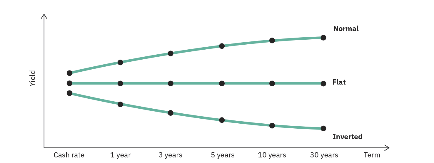
The shape of the yield curve can be used to infer the health of the economy and business cycle positioning. A “normal” yield curve slopes upward, with investors demanding higher yields to compensate for the risk of lending over longer periods. A “flat” curve occurs when the market sees little difference between short- and long-term risk, often in periods of transition or uncertainty. An “inverted” curve, where short-term yields exceed long-term yields, has historically been seen as a warning sign of economic slowdown or recession, as the higher short-term rates imply that the market expects the central bank to cut interest rates to stimulate the economy and therefore longer-term rates will be lower.
Another familiar, yet potentially confusing, term is the risk-free rate. The risk-free rate is the return that a theoretically riskless asset would generate and therefore establishes a minimum return benchmark for any risky asset. A rational investor requires a higher return as compensation for the increased risk. Short-term government debt (i.e. the policy rate) is commonly used as a proxy for the risk-free rate as it is assumed that there is zero default risk due to the government backing. The risk-free rate serves as a building block for most asset valuation methods, with applications ranging from traditional discounted cash flow methods for equities to continuous-time option pricing models.
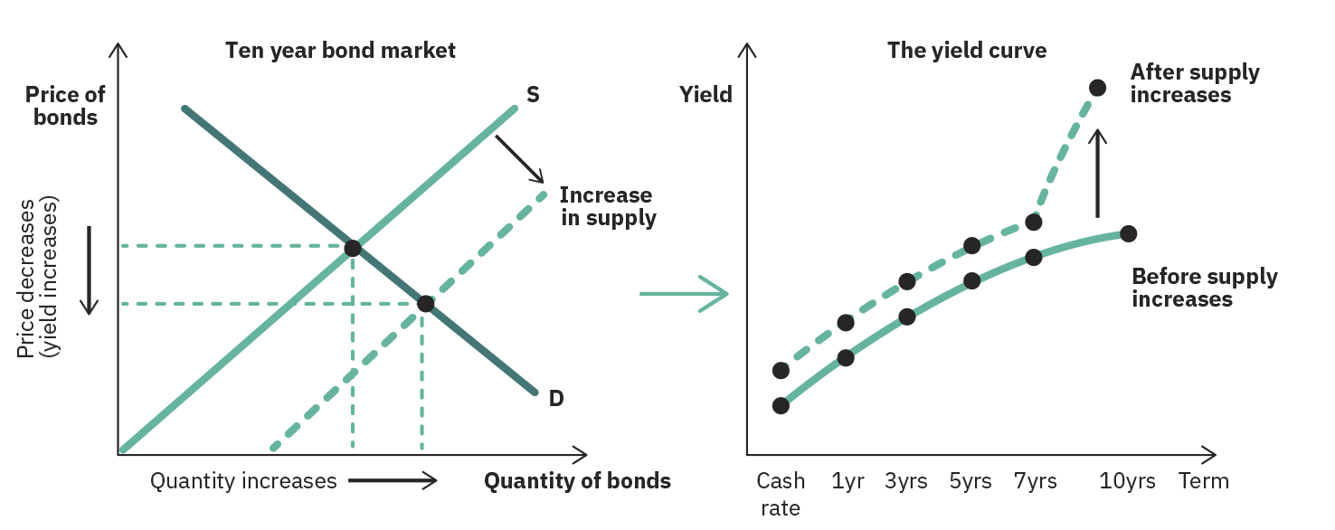
Beyond capital markets, government debt and the yield curve can have everyday implications. Current and projected interest rates are used by banks when pricing mortgages and consumer loans, meaning that even the ‘Australian Dream’ is a function of government debt and the yield curve. Further, the level of government debt will have an impact on long-dated yields, and the repayment of this debt is largely funded via taxation. When a nation is in fiscal deficit (spending more than they earn) it will issue more bonds to cover the funding shortfall and as the supply of debt increases, the yield investors demand as compensation increases. As the yield increases, so does the cost for the government to service the debt, and therefore the level of taxation revenue required to meet repayments.
Case Study: Global Yield Curves throughout the 2020s
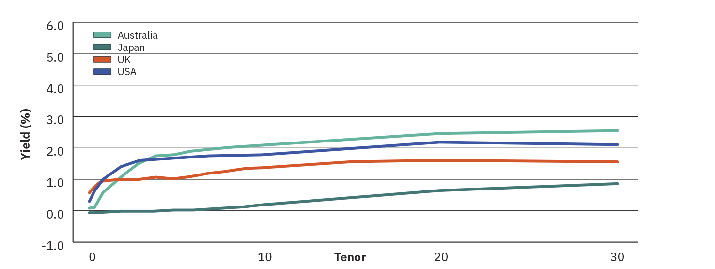
Following the GFC and leading into the pandemic, policy rates and, by extension, yield curves throughout much of the Western world, including Australia, were at or near all-time lows. Throughout the 2010s, fiscal debt steadily increased as governments capitalised on cheap funding. Once the pandemic hit, central banks rushed to cut already low policy rates in a bid to support frozen economies. Global yield curves shifted downwards and were relatively flat, sitting between 0-2% across tenors depending on jurisdiction. Some areas of the Eurozone and Japan were exceptions to this, where the circumstances surrounding the pandemic led to negative short-term yields in a bid to discourage saving and stimulate struggling economies. This further reduction in borrowing costs coupled with extensive quantitative easing and Covid stimulus programs caused national debt levels to spike.
Flat Yield Curves – Pandemic Uncertainty
February 2020
As we came out of the pandemic, a combination of increased personal savings, suppressed demand, geopolitical risks, and supply chain shocks led to the most inflationary period experienced in the Western world since the oil shocks of the 1970s. This led to central banks around the world rapidly increasing interest rates to combat inflation. The increase in interest rates saw short-term yields steepen (anticipating successive rate increases) and caused the entire yield curve to shift upwards, leading to what has been described as the “worst bond market in history”. The increase in bond yields (pushing prices down) paired with widening credit spreads (due to recessionary fears) and a soft equity market meant that there was little solace for traditional 60/40 investors throughout 2022.
Normal Yield Curves – Rapid Rate Increases
February 2022
By the end of 2023, global inflation was largely under control although fears of sticky inflation persisted (and still somewhat persists today). The intensity of the rate hiking cycle had now given way to growing recessionary fears as economic growth was expected to slow and further fuelled by the collapse of Credit Suisse and the US regional banking crisis earlier in the year. The US yield curve inverted, reflecting market expectation of near-term rate cuts being required to stimulate a slowing economy and demand for the safety of longer-dated debt. Debate now centred around whether Western economies could achieve a soft landing (no recession) or face a hard landing (recession). This debate has since calmed with persistently strong equity markets and resilient labour markets, however economic uncertainty remains.
Inverted Yield Curves – Recession Fears
December 2023

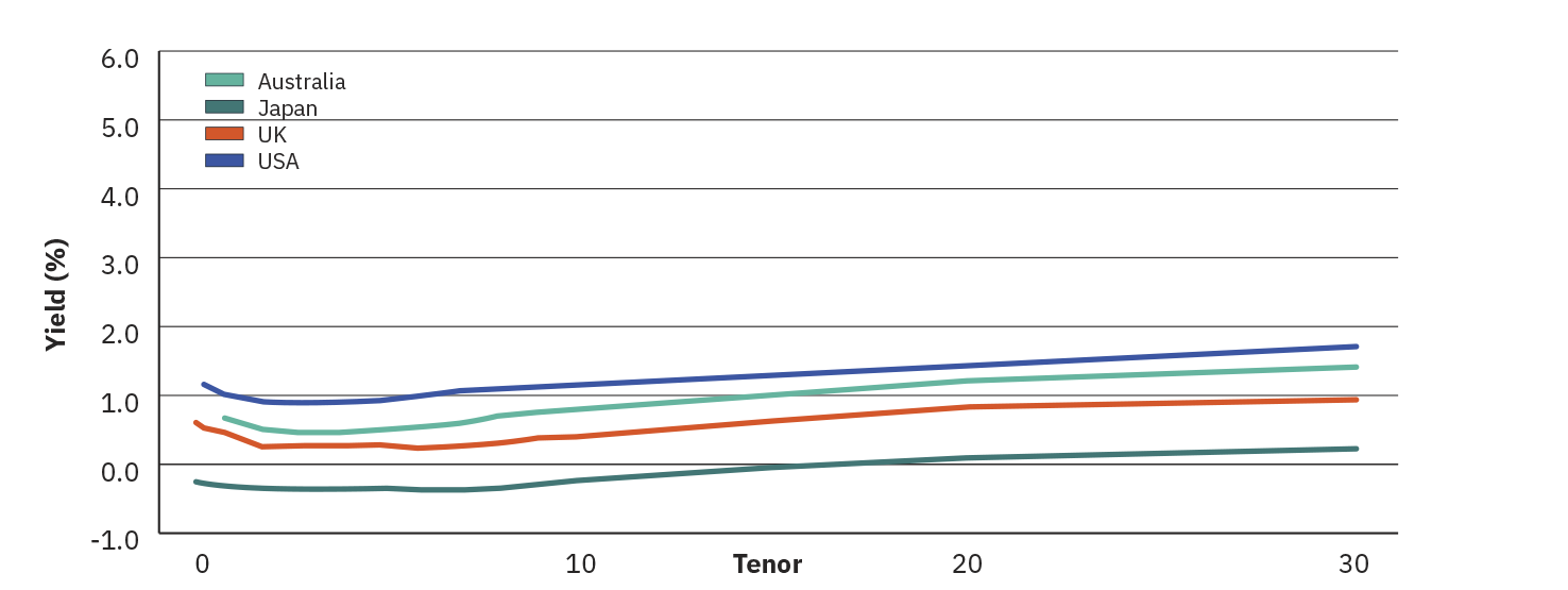
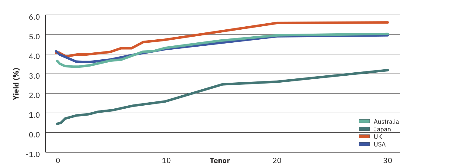
That brings us to today, where global yields across the curve are materially higher than they were at the start of the decade and steepness has returned. The Australian yield curve remains largely anchored to the US curve, with both economies anticipating a fall in short-dated rates as the central banks reduce their respective policy rates and long-dated rates are higher due to investors requiring a growing term premium as compensation for rising debt levels. This dynamic has seen bond fund managers implementing a curve steepener trade, where they buy short-term bonds while selling long-term ones, profiting from expected changes in curve steepness. Rising debt levels and the associated increase in yields provides some context for why the US is aggressively implementing tariffs on its trading partners, generating additional revenues to fund the growing debt and recently announced tax cuts. The evolution of the Japanese yield curve has been one of the more intriguing developments of the decade, with the central bank ending their yield curve control program causing yields across the curve and specifically in the long end to surge. After decades of low rates in Japan, the increase in Japanese yields may add further pressure to the global financial system as capital flows are redirected into Japan to capitalise on higher yields, potentially reducing demand for other sovereign debt and as consequence, pushing those yields higher.
Normal Yield Curves – Fiscal Concern Steepening
August 2025
Summary
The yield curve is more than a concept in a textbook, it offers real-time information on economic conditions, policy direction, and market sentiment. Over the past decade, the evolution of global yield curves has traced a path through ultra-low interest rates, pandemic-induced uncertainty, inflationary shocks, and one of the most aggressive rate hiking cycles in modern history.
Today’s steeper curves and elevated yields are a stark departure from the post-GFC status quo. Current curves are shaped by growing fiscal pressures, geopolitical shifts, and recalibrated monetary policy. For investors, understanding the yield curve can provide insight into their portfolio’s performance, borrowing costs, and household finances.
By comprehending the signals embedded into the yield curve, investors can better anticipate market shifts, assess risk, and position their portfolios for resilience and growth. The yield curve doesn’t just reflect the current economic environment, it informs where we may be headed.